
Brandon Printed Font is popular among designers and typographers for its unique and distinctive appearance. Typography is the unsung hero of design, silently but significantly impacting the visual experience of any printed material. It’s like a secret language that speaks to our subconscious, triggering emotions and influencing how we perceive information.
The right choice of font can make or break a design, transforming an ordinary piece into something extraordinary.
Imagine reading a book with misaligned letters or trying to decipher an important message written in Comic Sans – it just wouldn’t have the desired impact. Typography has this uncanny ability to set the mood and tone for communication. Whether it’s elegant serifs conveying timeless sophistication or bold sans-serifs exuding modernity and confidence, fonts are powerful tools that shape our perception of content.
The versatility of typography provides endless creative possibilities for designers. Each typeface carries its own personality – from quirky hand-drawn scripts evoking playfulness, to clean geometric sans-serifs radiating professionalism and reliability. Every curve, every line matters; they add depth and character to words.
Choosing the perfect font requires more than just aesthetics – it involves understanding context and target audience as well. A subtle change in typeface can evoke nostalgia or introduce freshness. For instance, pairing a vintage-inspired serif with contemporary imagery creates an intriguing blend between past and present.
So let us pause for a moment when admiring beautifully designed materials; appreciate the thought behind each letterform quietly speaking volumes through their intertwining strokes – for typography is not merely about alphabets arranged coherently; it is artistry at its finest showcasing
In this article, we will explore the significance of typography, delve into the characteristics of Brandon Printed, and discuss the importance of choosing the right font for your projects.
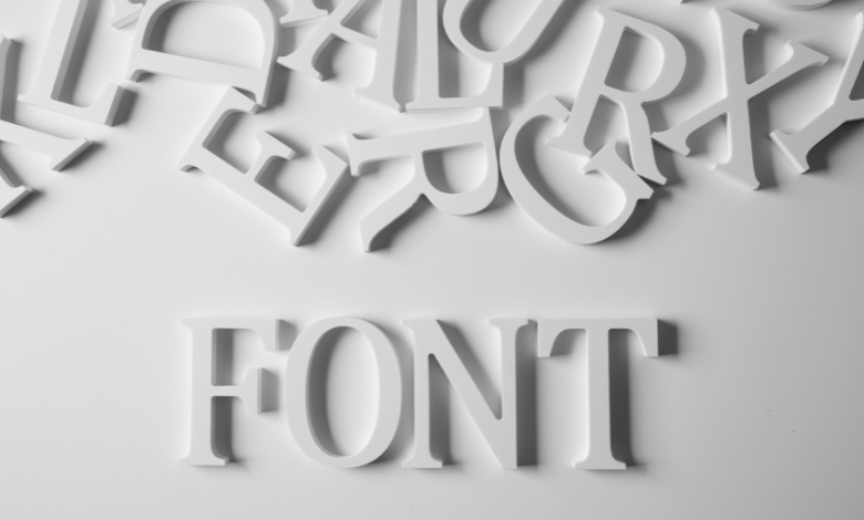
Section 1: Understanding Typography
Typography is not simply selecting a typeface; it is an art form that combines visual aesthetics with effective communication. By properly utilizing typography, designers can convey emotions, create hierarchy, establish brand identity, and enhance readability. The choice of font can drastically alter how a message is perceived, making it a critical element in any design project.
Section 2: The Beauty of Brandon Printed
Brandon Printed is a typeface created by renowned designer Hannes von Döhren. It is an extension of the popular Brandon Grotesque font family, but with a hand-drawn, printed look. This gives it a distinct, raw, and authentic appearance that adds character to any design. The irregularities in the font mimic the imperfections found in printing processes, adding a sense of nostalgia and uniqueness.
The letters in Brandon Printed have a charming and handmade quality that sets it apart from traditional fonts. This typeface exudes a sense of warmth and approachability, allowing it to be used in a wide range of contexts, from branding and packaging to editorial design and signage. Its versatility makes it an excellent choice for both digital and print mediums.
Section 3: The Importance of Choosing the Right Font
Typography choices should never be made arbitrarily. The choice of font should align with the intended message, target audience, and overall tone of the project. Using the wrong font can create confusion, undermine credibility, or dilute the intended impact.
Brandon Printed, with its unique characteristics, can effectively convey authenticity, creativity, and a handcrafted feel. It is especially suitable for projects that aim to evoke a sense of nostalgia, such as vintage-inspired designs or products that want to communicate a handmade, artisanal quality.
However, it is essential to consider legibility and readability when selecting a font. While Brandon Printed is undoubtedly eye-catching, it may not be suitable for long paragraphs of text due to its irregularities and intricate details. It is advisable to pair it with a more legible typeface for body copy to ensure optimal readability.
Section 4: Examples of Successful Usage
The popularity of Brandon Printed continues to grow, and it has been successfully used in various design projects. Many businesses that seek to convey a unique identity have incorporated this font into their branding materials. From beer labels with a retro vibe to music album covers with a hand-drawn aesthetic, Brandon Printed has proven its versatility.
Brands like Levi’s, Urban Outfitters, and Starbucks have capitalized on the appeal of Brandon Printed to create captivating promotional materials that capture attention and resonate with their target audience. By combining this font with other design elements, they have crafted visuals that leave a lasting impression.
Conclusion
Typography is a critical aspect of design, and fonts like Brandon Printed can greatly enhance the impact of printed materials. Its unique appearance, reminiscent of hand-drawn lettering, stands out in an increasingly digital world. However, it is crucial to choose typography thoughtfully, ensuring that it aligns with the message, target audience, and overall visual hierarchy of the project. Balancing aesthetics with readability is key for successful implementation.
Brandon Printed provides designers with a versatile tool to evoke authenticity, creativity, and nostalgia. When used appropriately, it can create a tactile and appealing experience for readers, users, or consumers.